VALORANT MOBILE
Introduction
· · ─ ·𖥸· ─ · ·
It started off as an Idea after I finished redesigning Valorant Agent. I made my five simple frames on how I think Valorant Mobile would look starting with the sign in options + sign into RIOT account, Valorant Main Lobby, and the Play Screen. After continuing my courses from Coursera by Google, and a few YouTube videos I’ve learned how to Prototype and my entire project spiraled into this interactive prototype. I hope you enjoy :)

Problem Solving

How do I make this PC only game into a mobile game, with all abilities of the agents. I’ve thought around this for a while before creating my first initial four frames. I had originally put the header bar with the agents on both teams + timer on top but thought it looked cluttered as it was with all the abilities so I had compacted it into a similar layout as Wild Rift mixed with TFT.

Advice and Notes!
While I was working on what I had, I had reached out to several people who has decent knowledge of Riot Games itself. I have a friend who is a VFX artist with Blizzard Entertainment and they sent me to a senior UX artist on World of Warcraft who had given me good advice on how to better the application and for future use as I continue my journey as a UX/UI Artist.

Notes from friend who knows Riot Games decently.
Ideation

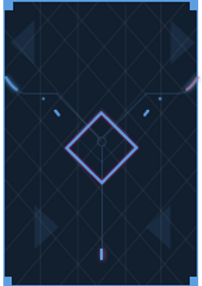
The main sketch that started this project 07/2023
I had started with low-fidelity wireframes on paper, or my iPad using Procreate or ( app name ). I came up with the layout of the frames as I went on more into the design, and while I was actively working. My sketches were based on what I thought it would look like. Once I had it established I moved into making my wireframes into Figma and after conducting some mini user research I had adapted the frames to what they had to say about it.
Wireframes!


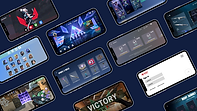
Interactive Prototype!
An Interactive Prototype! Click around :)
UI Design
This was my biggest challenge as a designer. I had the main layout of the frames how I wanted it. Then it came down to making everything look like the game itself. I had spent many hours recreating the lines, squares, circles, patterns, colour schemes, typography, occasionally wanting to pull my hair out over mini things that were not cooperating.

Mobile APP Icon
I designed three distinct app icon variations to bring Valorant’s visual identity into a mobile context: the main color version aligned with the game’s core palette, a purple variant for themed events, and a Clove variant inspired by the agent Clove.
The icons are first showcased within an iPhone home screen mock-up, illustrating how they stand out in a real-world setting among other apps. Below, each version is displayed individually to highlight color choices, detailing, and adaptability for different seasonal or promotional uses.
By presenting the icons both in situ and in isolation, the design demonstrates brand consistency, versatility, and high recognizability, ensuring they remain impactful even at small sizes on mobile devices.


Night Market UI
For this project, I recreated Valorant’s Night Market experience by translating its PC-based interface into a mobile-friendly design. My goal was to preserve the original game’s aesthetic and excitement while optimizing usability for smaller screens.
I meticulously replicated the intricate details of the Night Market cards, from geometric shapes, neon accents, and rarity color coding to the way discounts, prices, and skin names are presented. The locked card state builds anticipation with a clean, futuristic mystery design, while the revealed card state delivers clear hierarchy: discount percentage, original and discounted prices, and high-quality skin artwork are all instantly recognizable.
This adaptation balances faithful visual replication with mobile-first UI considerations, ensuring the design feels authentic to Valorant while remaining intuitive, readable, and engaging on a handheld device.


Conclusion
This has pushed my creativity to a whole new level I never knew I had. I’m proud of everything I’ve accomplished and all the positive feedback in this. I can’t wait to venture more into the world of games to create complex and amazing UI for gamers alike. :D
-
This is a concept project, there was no client.
-
The purpose was purely to show skill in UI.